It’s finally here, the Roman Numeral Edition of Hyperion by Dan Simmons! This has been one hell of a journey since I first started the concept for this edition (just over a year). Whilst not quite the final production version as there are some small changes I want to make, I am happy with where it is up to, enough to share with everyone.
For those that are interested, I have detailed the long and arduous road of the production of this edition, but I know some people are just here for the pictures and specifications, so here they are:
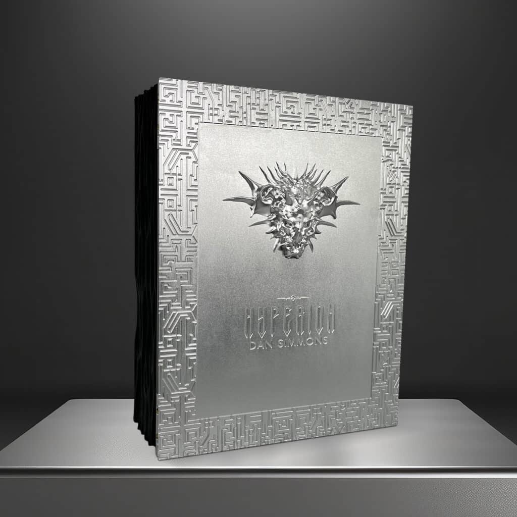
Enclosure
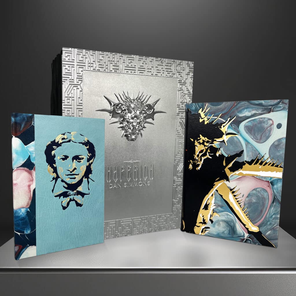
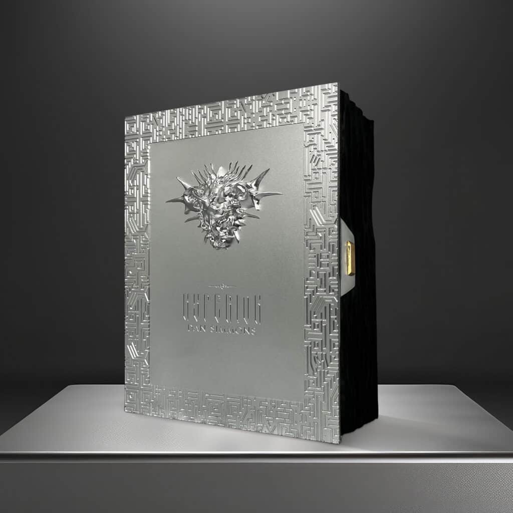
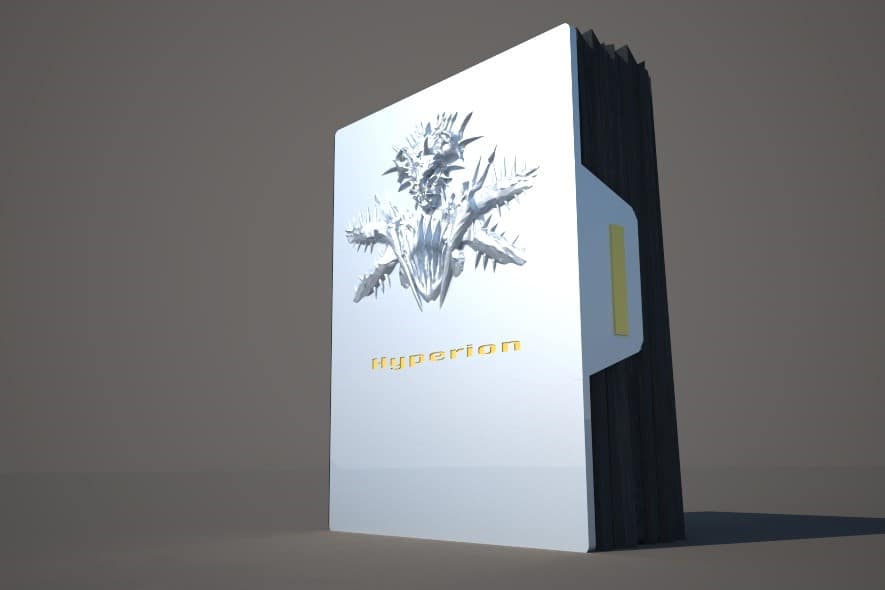
The box has two pieces of milled aluminium for both the lid and backpiece, these have been metal plated with nickel to give a darker look to it than the anodised versions in these pictures (which I thought was fitting). The lid has been milled out of one single piece of metal to encompass the head of the Shrike and labrynth borderwork which is also on the backpiece.
Oak has been used on the rest of the enclosure, and this has been hand scorched black by our boxmaker and the edges have been milled out to complete the design. The lift has been secured with hinges and is held fast with a magnet when opening and closing.
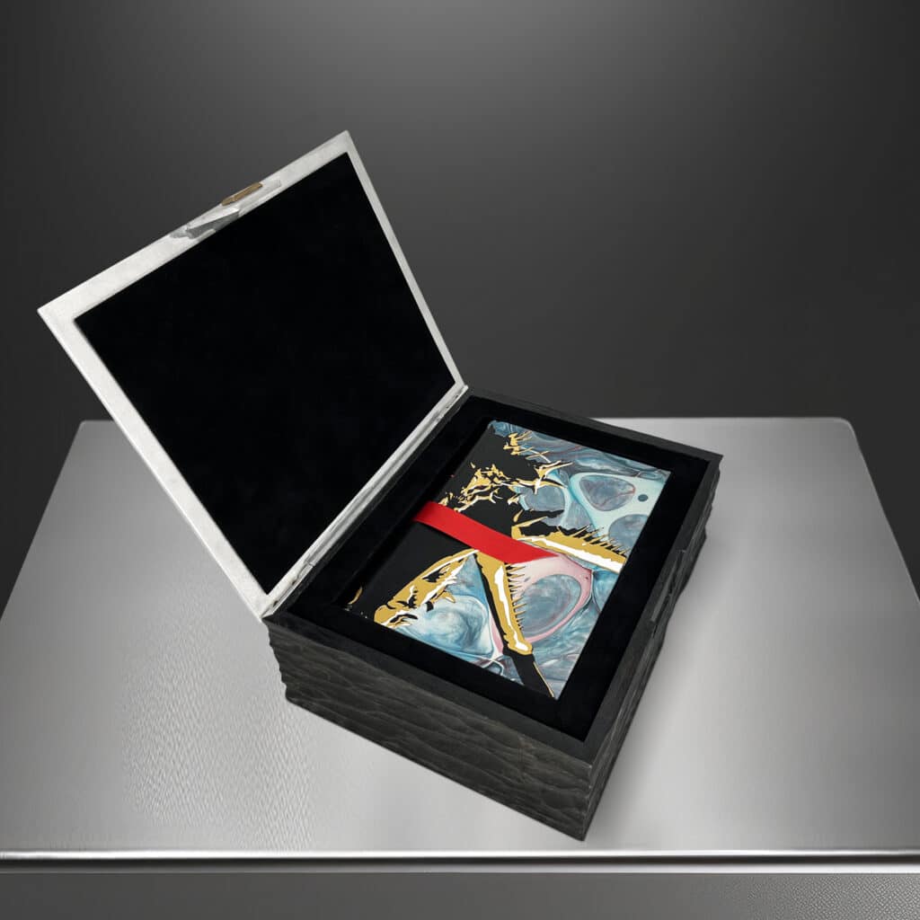
Inside the box there is an inner well which houses both John Keats’ epic poem “Hyperion” and of course our Roman Numeral Edition. It is lined with black suedel and two red ribbons have been installed to ensure a smooth release of each book.
The inside of the lid has a piece of original artwork by Jaime Jones bound into it and finished with suedel. Each of these images follows one of the pieces contained within the book and have been hand drawn by Jaime using a crow quill and ink. This prototype does not have the art in, but the final production version will do.
The Book
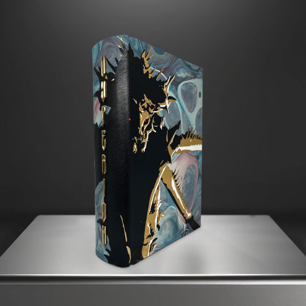
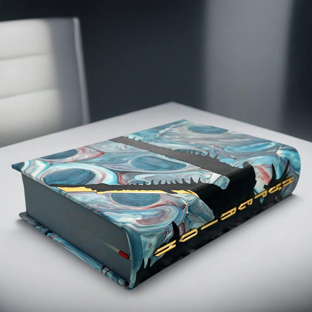
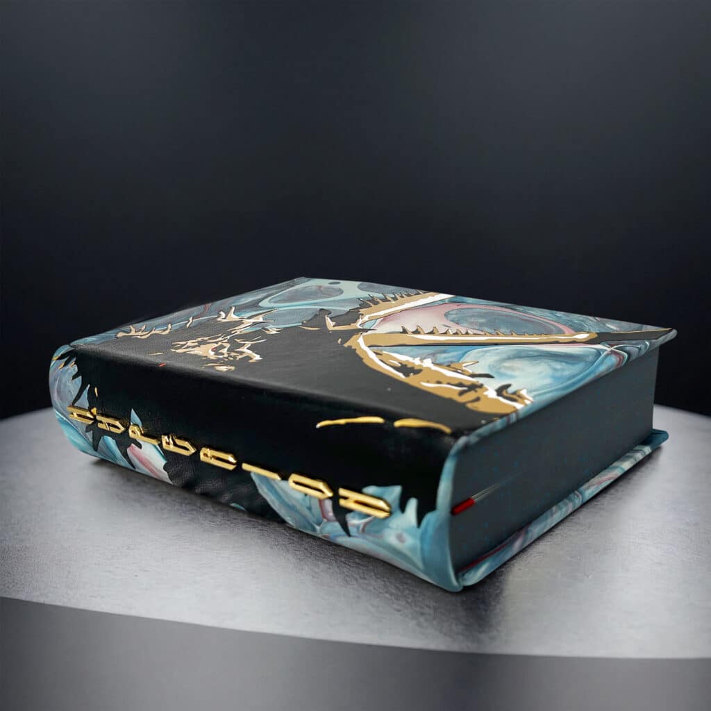
Completely covered in goatskin leather that has been hand marbled by Freya Scott of Paperwilds. The colours come from a description of the planet Hyperion from the book.
There is then a large piece of Harmatan fine goatskin onlay onto the case with three hits of foil stamping for the highlights and eyes. The spine has been rounded, and we also have brass letters spelling out the title of the book recessed into the leather for sturdiness.
The final production will have hand sewn head and tailbands, we have used a simple red and black for the prototype. We also have hand dyed and splattered across all three edges, and a red ribbon.
For the endpaper we’re using a tactile and textured high quality black paper with a foil stamped design on. The paper used is Liber Charta 145gsm and this edition also comes with a custom limitation page letterpress printed in two colours by Pat and Ellen at Nomad Letterpress.
This book features all the artwork from the other editions and has the Shrike and Consul endpapers as foldouts within the book.
John Keats' "Hyperion"
This legendary poem and key storyline in the Cantos has been set in hot metal using monotype Caslon. Cast and typeset at Nomad Letterpress by Neil, this has been printed on T.S Edmund handmade paper that dates back to the early 1900’s. We have gone as historic as we possibly could on the paper and typography so as to match up to the era John Keats lived in.
Quarter bound in multicoloured leather by Freya Scott of Paperwilds with gold stamping on the spine. The rest of the boards are covered in finest harmattan goatskin with a depiction of Keats himself illustrated by Jaime Jones has been foil stamped into the cover in dark blue and gold. The endpapers match those of Dan Simmons’ Hyperion, a textured black paper.
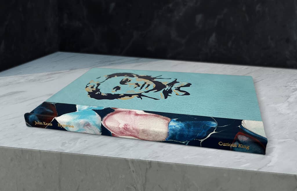
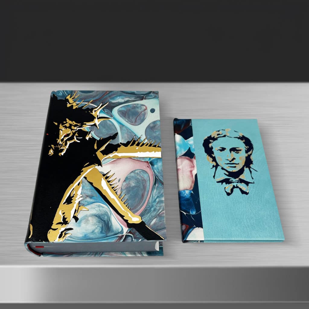
Purchase Info
The price point for this edition is £7,000 and there will be 10 copies made, with 8 of these up for sale. The 6 owners of the RN Fifth Season will get first refusal, and any copies not taken up will be put up for lottery with the 2 copies without rights.
I will be contacting current Roman Numeral owners following this post, and any copies not taken up will be put in the lottery.
This edition is being printed at the same time as the other two editions and will ship with them later this year.
For clarity we will not be doing any Roman Numeral Editions of the other books in the Cantos, it will strictly be for Hyperion only.
For those wanting to be considered in the lottery please email support@curiousking.co.uk – for those not familiar, winners will have to pay for the book… They aren’t a prize!
The Making of...
How did I end up here? Well, it’s a long story, so buckle up. One long year, numerous concepts tried and torn up, Shrike dreams, and a shed load of money.
Enclosure
After securing the rights to Hyperion I spent quite a lot of time brainstorming ideas for each tier-design. From quite an early stage in the process I really liked the sound of a metal enclosure as I felt it fit well with the story. One it’s quite sci-fi, and two, the Shrike is literally made of metal.
I had an idea to try have the Shrike bursting out of the metal, like it was enclosed and trying to escape (sort of like Han Solo in the carbonite). How was I going to do this though? After having some discussions with my stone mason, he suggested I get in contact with the Makers Space at Salford University.
The Makers Space is a department at Salford University for all of their students to use. It has state of the art equipment for Rapid Prototyping, and the staff there are very knowledgeable about what methods to do for certain ideas/finishes.
Jaime Jones the artist actually had created a rudimentary 3D model of the Shrike when he was prepping for the artwork, so I was able to use some of it to create a visual concept of what I was looking for. Here it is:
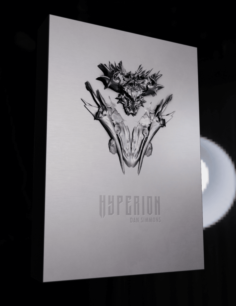
As far as a concept went I was quite happy, though was keen to do the whole bust as I really wanted it coming out of the metal, like it was coming at the reader. After discussing my idea and concept at the makers space, it did seem possible to do. Either by 3D printing it in metal, cast in metal or potentially having it milled out of one piece of metal. I really wanted it to be milled out of metal so there were no joins and it felt like it was just one piece.
My next stop was providing a 3D model that was the right filetype for either milling or printing. Unfortunately, the model I received from Jaime was hashed together (as it was only for illustrative purposes) and didn’t have the correct geometry to print or mill. I was getting knee deep in STL’s, .STEP files and OBJ files, all which I had never encountered before. As Jaime was focusing on the art, I had to find someone else refine the file. I eventually settled with Hobs 3D due to the professionalism of their work, but this came at quite a cost.
After some time Hobs came back to me with a bust in the correct filetype to use, however once I got it to the makers space they told me it was far too detailed with over 8 million polygons. Luckily one of the geniuses (George) who worked there was able to do some simplifying of the model to around 2 million polygons that didn’t lose any of the design details. It was around this time that they told me having this piece milled out of one piece of metal wasn’t really possible, and my best bet would be to 3D print this in metal, or have it cast and fix it to a metal back plate.
We then progressed onto 3D printing the design in the usual SLS to see what it would look like, and the result is below:
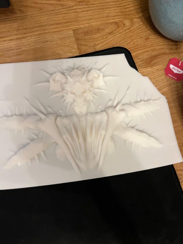
I was largely happy with how this looked, and then proceeded to use this design when working on the mockups of the box itself. Whilst garnering Jaime Jones’ feedback, he pointed out that it might actually look better if it was just the Shrike head on the box, not the full bust and I agreed with him.
Around this time my boxmaker said it would be possible to have the head 3D printed or cast in metal, then he could fix this to a piece of metal for the lid and engrave the designs on it. So I set about trying to find a local company that could cast or print this thing based on the files I have. After contacting about 15 different companies there was only really one that said they could do it as most of these businesses cast/print for industrial work and my little project wasn’t of interest.
Whilst jumping on the company that said they might be able to do it, they spoke to their manufacturers and told me that it could be possible to have the head milled instead of cast, which was great news. I then requested a prototype to be made so I could get this back to my box maker. As this was going on, the boxmaker had come back with some design ideas for the box based on my brief, image below:
I really liked the idea of the textured wood sides to make it look a bit more interesting and less “flat”, so we progressed with the idea.
After some back and forth I was able to get the Shrike head milled in metal and sent it off to the boxmaker to grind off the back so it could be attached to the lid. Once complete I had the first iteration of the Shrike box which I was fairly happy with, but still not completely satisfied (there’s a theme here). You could still see the join on the Shrike head, and the engraved design felt very shallow.
I then decided to redouble my efforts at getting this done in one piece, so I went back to my metal fabricator and asked the maximum size I could have something milled. Luckily their manufacturer said it was feasible to do the whole lid in one piece but due to the amount of metal that had to be milled away it was going to be pricey. Caution to the wind, I amended the designs and had some more files made up by another modeller and went back to the fabricator.
Some more testing and I eventually received the first iteration of the lid, and ultimately it looked really good. My only issue was the finish, as I wanted it really clean, with a sheen to it, but not a mirror finish as that would look a bit odd. My fabricator suggested two options, having it anodised or having it metal plated, so we tested both. After seeing both I went with the decision to have it nickel plated as it gave a nice finish that was slightly darker which allows makes the detail in the design more prominent. The one pictured is anodised, I am having the production done in nickel.
With the lid now sorted it was to the inside of the box. I always knew I was going to do Keats’ Hyperion with this edition, so I needed a well inside the box. Unfortunately you can’t build the well of a box until you have the finished books ready, otherwise sizing may be off. I hadn’t finalised the design of the books by this point unfortunately, so I redoubled my efforts on the book.
The Book
Usually when designing books, I come across a design/concept quite early that I really like and this design is often the one used (after progressing and tweaking). I still carry on designing after this as I don’t like the idea I haven’t explored other routes before making my decision. However, for the Roman Numeral Edition I was struggling to move forward with just one design, so I kept going with the concepts and discussed several with Freya and the bindery and had samples made up of various leathers. I’m pretty sure they were sick of me discussing yet another new idea.
Originally one of my concepts was to do a mass leather onlay design that followed the hero image of the Shrike done by Jaime Jones. I explored this with Chelsea Bindery due to their extensive use of leather onlay and spent a lengthy period having a feasible design made up. When I eventually got the design back I wasn’t completely in love with it as it felt a little too cartoony. Also the price of binding each book was incredibly high and would have pushed the price of this edition way over £10k and I felt this was too much due to the current market.
So it was back to the drawing board. I was really keen to use the Shrike on the book as it followed the box, but I was running out of budget to keep getting Jaime to do more images and he was completely stacked with the interior B&W inks and oil paintings. I then decided to have another artist recreate an image of the shrike to use on the cover, but again it didn’t feel quite right when put into mockups (sigh).
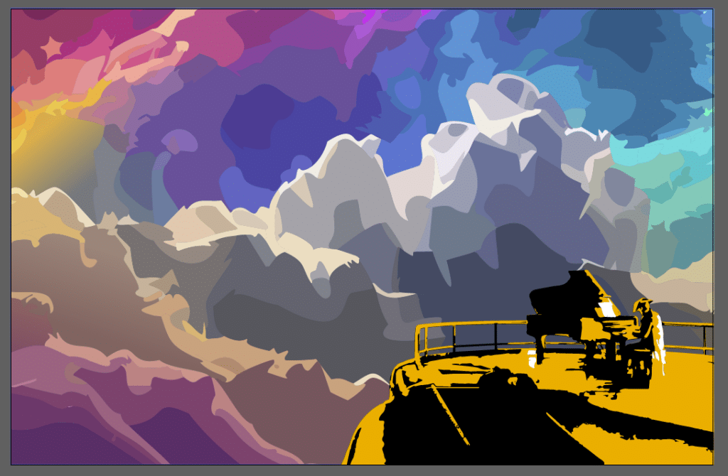
I then decided to progress another idea, the consul on his piano. Jaime had done a really cool landscape image of the consul playing piano on the balcony of his ship, and I thought it might look good to have the consul on the cover playing piano with a marbled leather background with vibrant milkyway colours (the galaxy, not the chocolate bar). So it was back again to Freya to see if she could make sense of the colours and execution of the leather. After going to see the tests Freya had done, there were some really cool marbled covers done but I was starting to feel the Consul wasn’t quite the right direction to go in. So, it was back to the drawing board… again. Aborted design below:
